Turning a nutrition app into a platform two people share.
NutriFlow was a solo app: you signed up, an algorithm handed you a plan, and that was the whole relationship. I rebuilt the client app, designed a dashboard for nutritionists from scratch, and wired the two together, so a plan is now something a client and a practitioner work on side by side.
- Role
- Product Designer
- Scope
- Mobile rebuild, dashboard 0 → 1
- Platforms
- iOS, Android, Web
- Industry
- Healthtech, Nutrition
- Timeline
- 2025–26
Real client engagement, real shipped product. “NutriFlow” is a pseudonym and a few identifying details are generalised for confidentiality. The screens, decisions, and thinking here are from the actual work.
A well-meaning app that nobody enjoyed using.
When I came in, NutriFlow did one thing: generate a diet plan and hand it over. No nutritionist, no back-and-forth, no room to adjust once your body or your week changed. The interface was dated, and the everyday flows, like logging a meal or checking your day, took more taps than they should. People signed up, tried it for a week, and quietly stopped.
One app, one direction
- Mobile only, no professional side
- Plans generated by the app, take it or leave it
- Dated UI, fiddly day-to-day flows
- Food logging only, with no mood, glucose, or ketones
- Nowhere for a real nutritionist to step in
A connected platform
- Rebuilt client app on iOS and Android
- A web dashboard for nutritionists, from scratch
- Pick a plan path: app-guided or nutritionist-guided
- An 8-character code links a client to a practitioner
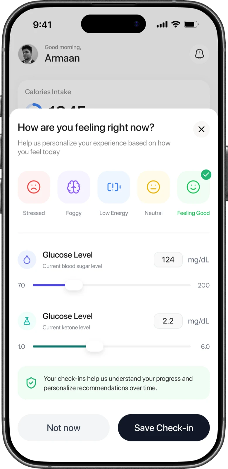
- Mood, ketones, glucose, macros, 27 micronutrients
The real work wasn't redrawing screens. It was turning a one-way app into a loop two people actually share.
Two very different users, one product to hold them both.
The brief looked like a redesign, but the moment you add a nutritionist it becomes a different product. A client wants their day sorted in a few taps. A practitioner wants to see how a week is really going and act on it. Serve one well and you can easily bury the other. The whole challenge was to make both feel light, on top of a lot more data than the old app ever carried.
Rebuild the client app
Most of the core flows weren't usable as they stood. Logging, home, and the plan all had to be reshaped, not just repainted.
Design the missing half
Nutritionists had no product at all. The dashboard was a 0 → 1: its own information architecture, built from nothing.
Two plan paths, one app
App-guided and nutritionist-guided plans had to coexist without ever leaving a user unsure which one they were on.
Data people can trust
Macros, micronutrients, ketones, glucose: numbers only help if they read as accurate and worth checking daily.
Rich data, simple logging
The app now tracks far more, but the thing clients do most, logging a meal, had to get faster, not slower.
Visibility that leads to action
A practitioner needs to change the plan, not just watch charts. Monitoring had to sit next to editing.
Make it a loop, not two separate tools.
The decision that shaped everything else: the client app and the nutritionist dashboard aren't two products that talk to each other. They're two ends of one loop. Right after signup, a client either goes app-guided or enters an 8-character code to link to a nutritionist. From then on, the practitioner's assigned meals flow straight into the client's plan, and the client's logs and vitals flow back into the practitioner's view. One source of truth, no copy-paste, no email attachments.
Paired once with an 8-character code. After that, the client's logs and the nutritionist's plan keep syncing on their own. One source of truth, no email attachments, no copy-paste.
Every screen on one canvas.
Before going into either surface, this is the whole product on a single map: launch and sign-in, onboarding, the home hub, and each of the four tabs. It's what I designed against to keep the client app and the practitioner dashboard coherent as they grew. Drag to explore.
From avoided to opened every day.
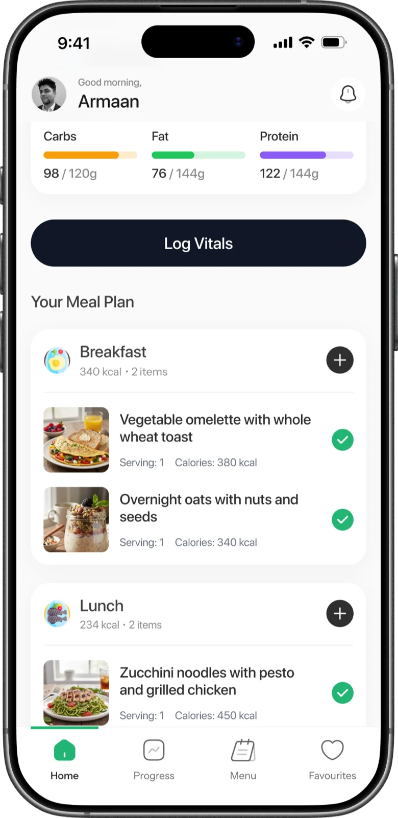
The client app is built around one honest question, what do I do next, with logging kept to seconds and the health signals that matter close at hand. The same plan structure carries both app-guided and nutritionist-guided users, so the product never splits into two apps.
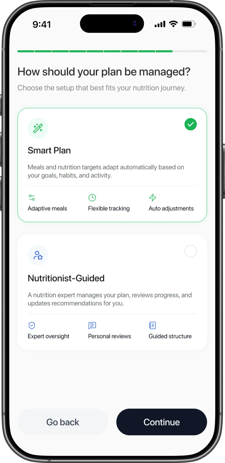
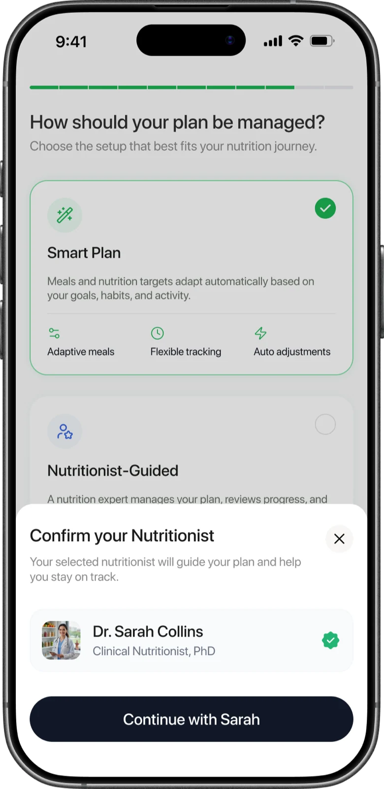
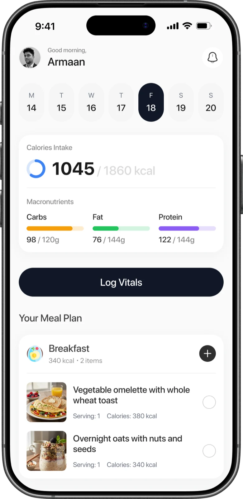
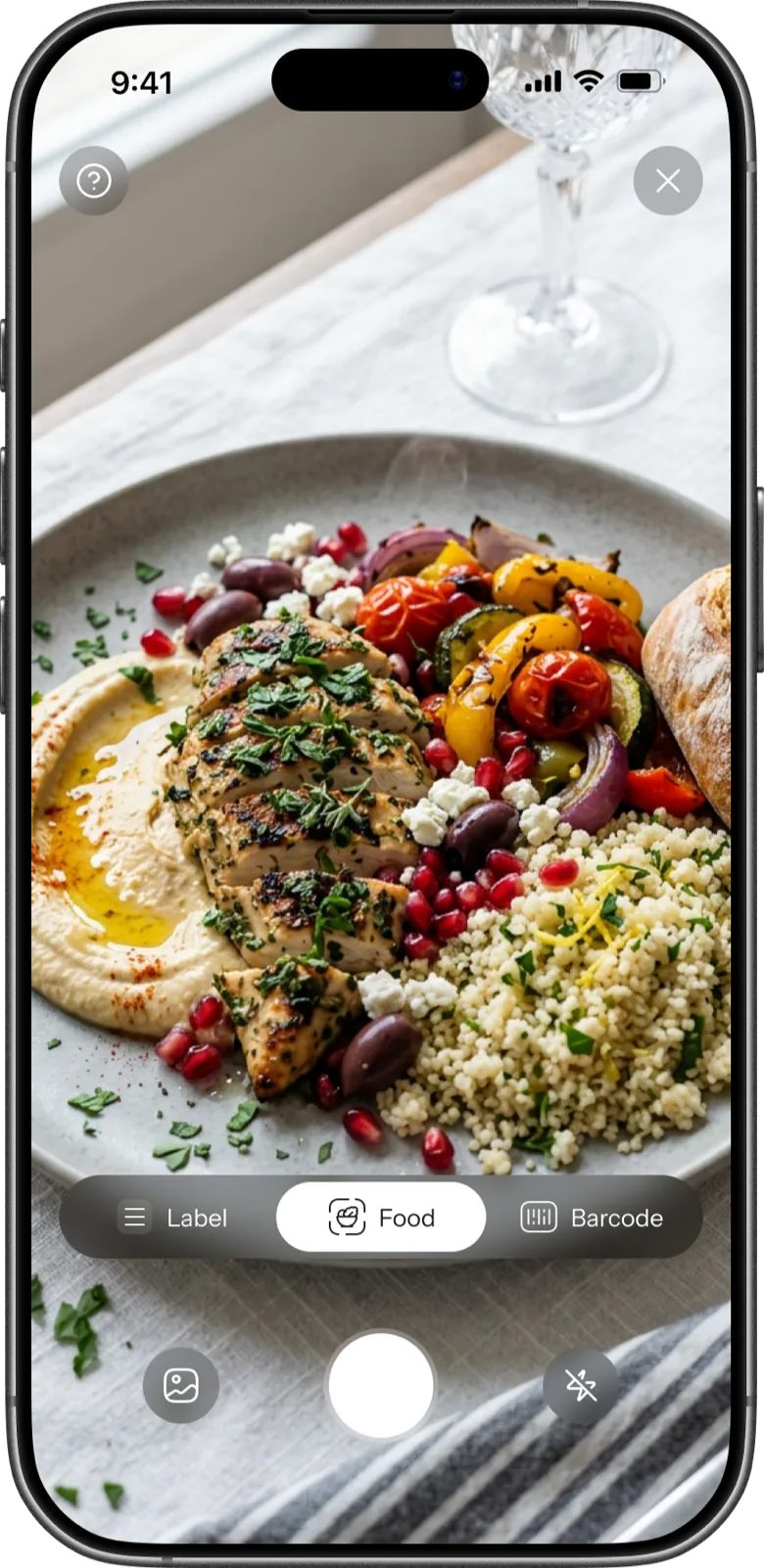
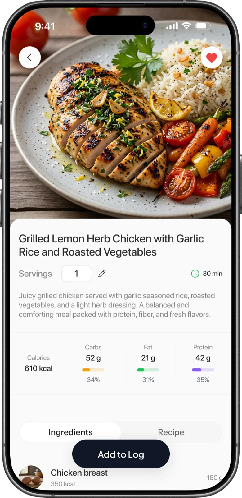
Three ways to log a meal, because people log differently: a quick photo at lunch, a barcode for a packaged snack, a label when the detail matters. Whichever they pick, the summary shows first and the full breakdown is one tap away.
The professional side, built from nothing.
This is where most of the design work went. The dashboard is where a nutritionist finds a client, reads how their week is actually going, and adjusts the plan on the strength of it. I designed it so monitoring and editing live in the same place, because a practitioner who can see a problem but has to leave to fix it will simply stop looking.
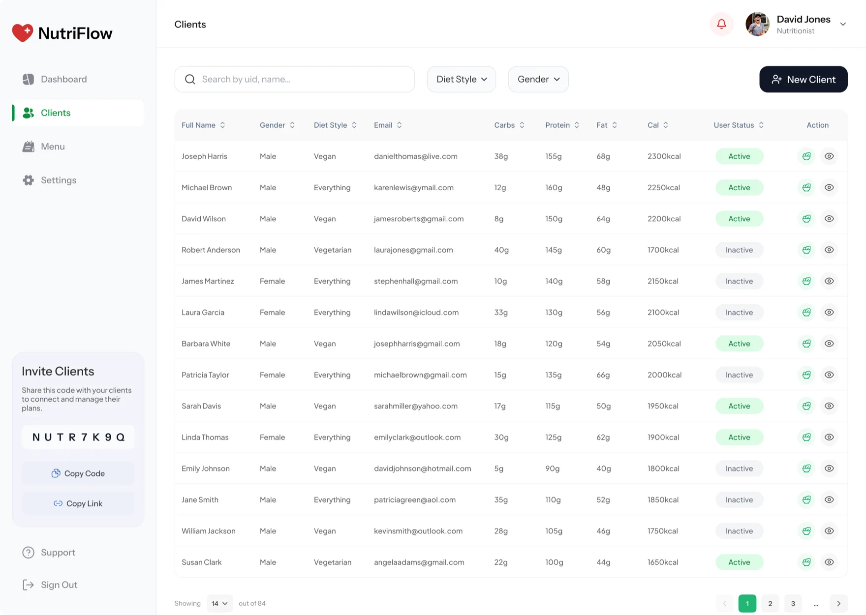
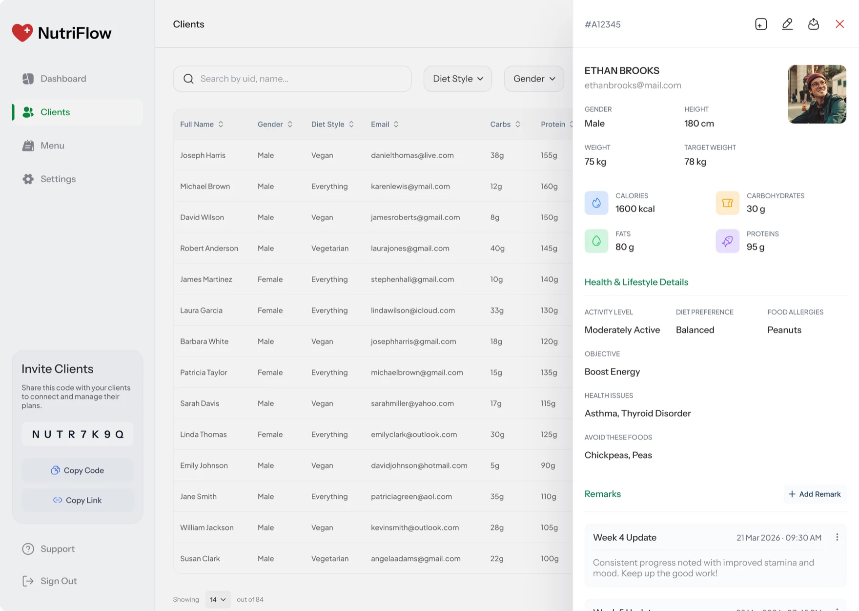
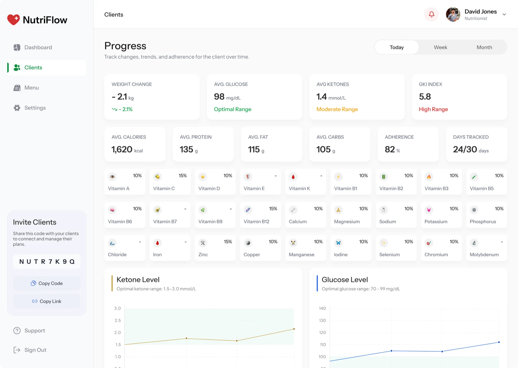
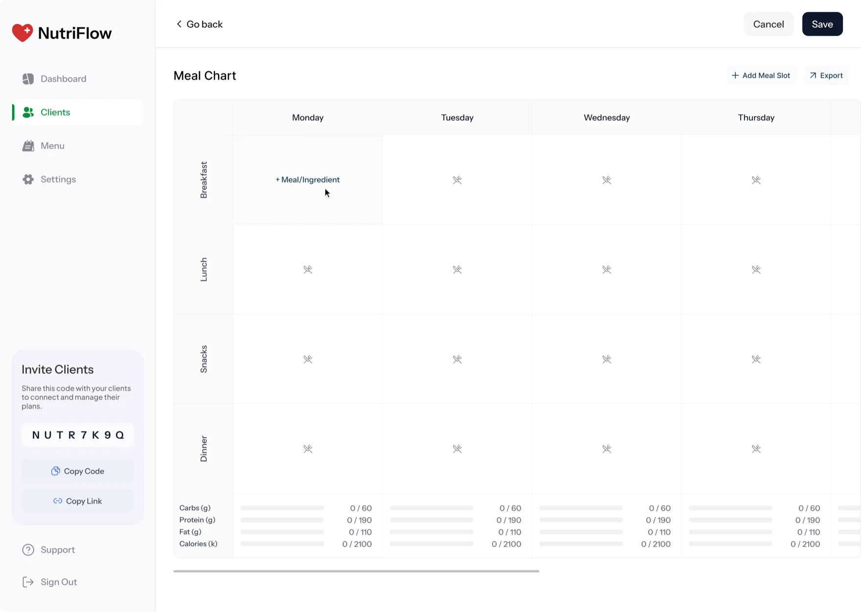
The weekly meal chart is the heart of it. A nutritionist fills a grid, the same shape as the days they're planning, and every slot they set lands in the client's app the moment they save.
 Empty
Empty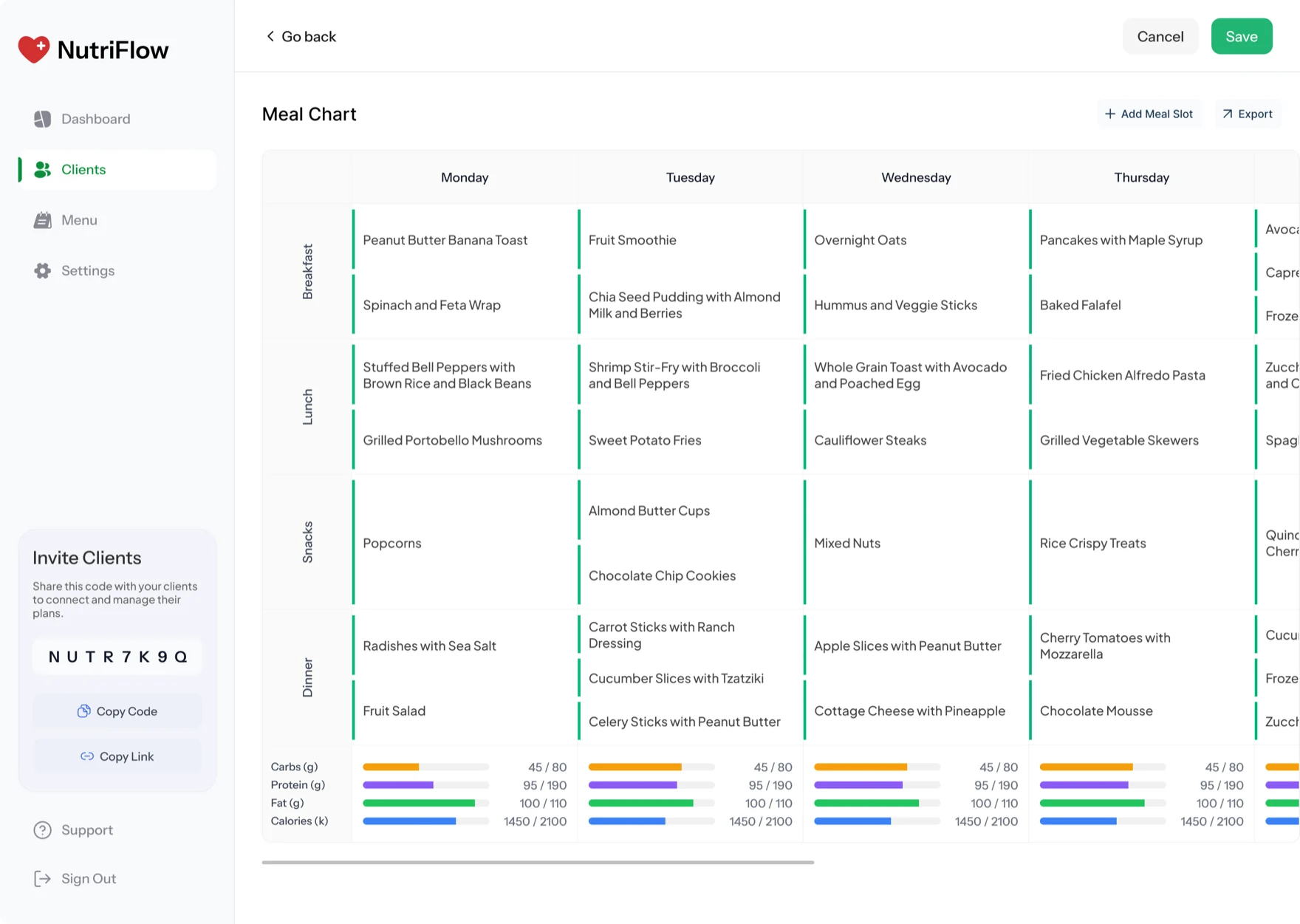 Planned
The work, by the numbers.
A single, hard-to-use app became a connected platform where clients track real progress and nutritionists can act on it. These are the wins that mattered most.
A new nutritionist surface, built from scratch
The web dashboard didn't exist. Now it's where every plan starts, gets adjusted, and shows results.
Mobile meal logging, three ways in
AI photo, barcode, and label scanning cut friction from the action clients repeat most.
Clients a nutritionist can actively manage
One roster, live progress, and an editable meal chart replaced a workflow spread across email, spreadsheets, and PDFs.
Time to build a full week of meals
The meal chart turned plan creation from a back-and-forth across documents into a single grid that syncs to the client's app.
Weekly app opens per client
Faster logging, a clearer next action, and the plan landing on home brought clients back about twice as often after launch.
Tracked in one progress view
Mood, ketones, glucose, the GKI index, macros, and the full 27 micronutrients, with adherence and trend charts.
A calm foundation both surfaces stand on.
Cards, charts, log components, plan modules, and metric widgets: one set of patterns carrying across mobile and web, so the two sides feel like one product. The tone stays quiet and health-focused, motion earns its place, and the system is set up to grow toward Apple's newer iOS direction when the team is ready.
- Cards
- Data tables
- Plan modules
- Progress & charts
- Status badges
- Forms & inputs
- Health metrics
- Empty & loading states
Design matters most when it changes the model.
What I take from this one: product design pulls the most weight when it changes the product model, not just the surface. The app that existed was a closed loop: sign up, the algorithm decides, done. Redrawing those screens would have made a nicer version of the same dead end.
Adding a second user and a shared source of truth is what actually moved it. A client can now grow with the product, alone or alongside a real nutritionist. The rebuilt app, the dashboard, and one shared system gave the team something that holds up today and has honest room to grow into next.